Does My Small Business Website Need Breadcrumbs?
Use breadcrumbs when customers need help understanding a deeper site hierarchy; on a small, flat website, clear navigation is usually enough.
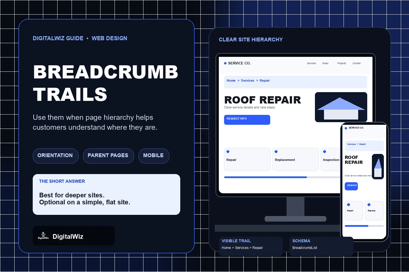
The direct answer
Add breadcrumbs when the website has a real hierarchy that customers may need to move through: for example, Home, Services, Roofing, and Roof Repair. They are especially useful on deeper service libraries, product catalogs, resource centers, multi-location sites, and other websites where a customer can land on an interior page without seeing the pages above it.
A small website with a homepage, a few service pages, an about page, and a contact page may not need them. If every important destination is already obvious in the main navigation and most pages sit only one level below it, a breadcrumb trail can repeat information without improving the customer journey.
Treat breadcrumbs as secondary navigation, not a replacement for the header, page title, contextual links, or mobile menu. The website mockups above illustrate a breadcrumb decision and responsive implementation. They are not a client website, usability result, ranking result, or performance claim.
- Deep or complex hierarchy: breadcrumbs are usually helpful.
- Flat site with only a few obvious destinations: they are often optional.
- Interior pages receive search or referral traffic: breadcrumbs can restore context.
- Linear form or checkout steps: use a progress indicator instead.
- Unclear site structure: repair the hierarchy before adding a trail.
Show hierarchy, not browsing history or process steps
A breadcrumb trail should represent the page's stable position in the website hierarchy. It should not replay the visitor's click history. Two customers may reach the same service page by different routes, but both should see the same clear parent path. A stable trail also prevents a direct visitor from receiving no context simply because there was no earlier page in the session.
Do not use breadcrumbs to represent a sequence such as Quote Details, Contact Information, Review, and Submit. That is a progress indicator because the labels describe stages in a process, not parent pages in a hierarchy. Likewise, Previous Article and Next Article controls are sequential navigation, not breadcrumbs.
Every item before the current page should lead to a real parent destination. Do not insert a category label that has no page, and do not invent extra hierarchy just to make the trail look substantial. If one page could logically have several parents, choose the canonical path that best represents the website's organization and keep it consistent.
- Good: Home > Services > Roofing > Roof Repair.
- Not a breadcrumb: Home > Google Search Result > Roof Repair.
- Not a breadcrumb: Step 1 > Step 2 > Step 3.
- Not useful: Home > Services when Services is not an actual page.
- Keep one stable parent path for comparable page templates.
Design the trail for desktop and mobile
Place the trail near the top of the page, normally below the global header and before the main heading. Keep it visually quieter than the H1 so it supports orientation without competing with the page's answer. Use familiar separators and clear link styling; the separator is decoration, not a link or part of each accessible name.
On a phone, do not shrink the trail until links become difficult to read or tap. A long path can wrap, scroll horizontally within its own region, truncate carefully, or show a shorter useful path such as the direct parent and current page. The right choice depends on whether omitted levels are still available through the main navigation and whether the customer can understand the remaining context.
Test long service names, translated text if the site supports multiple languages, zoomed layouts, and narrow screens. The current page label should not push an important heading or call to action below an oversized block of navigation. If trails become long on most pages, that may reveal an overly deep information architecture rather than a styling problem.
- Keep the trail close to the page heading.
- Make parent links recognizable and easy to activate.
- Do not rely on a tiny house icon as the only Home label.
- Handle long paths deliberately on mobile.
- Check wrapping, truncation, focus styles, zoom, and touch targets.
Audit the hierarchy before adding the component
Inventory the page types that could use breadcrumbs: service details, service-area details, products, project categories, articles, support resources, and policy libraries. For each type, write the proposed parent path and open every parent URL. If the path changes from page to page without a clear reason, or several labels do not lead anywhere, the site structure needs work first.
Compare the proposed trail with the main navigation and internal links. Breadcrumbs can expose useful parent pages, but they cannot rescue unclear page names, duplicate categories, orphan pages, or a menu organized around internal company language. The guide to small-business website navigation provides a broader framework for those decisions.
Then test realistic entry points. Open an interior page directly rather than clicking through from Home. Ask whether the page title, navigation state, and breadcrumb together explain the location and provide a useful route upward. If removing the breadcrumb makes no meaningful difference on a simple template, it may not earn the space. If customers would otherwise have to return to the menu or search again, the trail is doing useful work.
- List page templates, not just individual URLs.
- Write one truthful parent path for each template.
- Confirm every parent label has a useful destination.
- Open deep pages directly on desktop and mobile.
- Validate visible links and BreadcrumbList markup together.
Use this decision rule
Use breadcrumbs when the website has meaningful parent-child relationships and customers benefit from moving up that structure. Skip them when the site is flat, the current location is already obvious, or the interface is really a linear process. When you add them, keep the path stable, visible, accessible, responsive, and consistent with the structured data.
Review three interior pages that commonly receive search, ad, referral, or shared-link traffic. If their parent context is unclear, map the hierarchy before designing the component. If the structure is sound and the trail improves orientation, implement it once as a shared pattern and test every affected template. For help organizing a growing service website, explore DigitalWiz Website Development or contact DigitalWiz for a practical review.