← All articles
Web DesignSep 24, 20269 min readBy David K

What Should Be in a Small Business Website Navigation Menu?

Put the few destinations customers need most in the main menu, use clear labels, group related services under useful hub pages, and keep the complete path accessible on mobile and without fragile scripts.
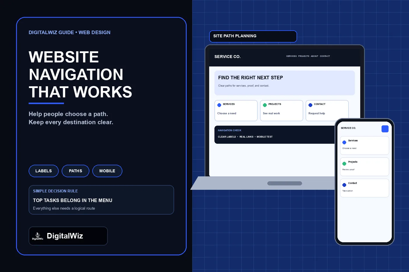
DigitalWiz website navigation guide with a dark editorial panel and responsive desktop and phone service website mockups showing clear paths to services, projects, and contact

The direct answer

A small business website's main navigation should expose the destinations customers need to choose, verify, and act: the primary service or Services hub, materially distinct service categories, real project or case-study proof when it exists, About, useful Resources when the library is maintained, and Contact or Request an Estimate. Keep a prominent call or booking action only when it leads to a real monitored path.

Do not treat the header as a complete sitemap. The main menu should carry the site's most important customer routes; secondary pages can remain reachable through service hubs, contextual links, breadcrumbs, and the footer. A short menu is not automatically good, and a long menu is not automatically bad. The test is whether a first-time visitor can identify the right path without decoding agency language or opening several vague dropdowns.

Use ordinary links with descriptive labels, preserve the same core order across the site, and make the mobile menu fully operable with touch, keyboard, screen readers, zoom, and JavaScript failure. Navigation is part of the information architecture, not decoration.

Illustrative navigation-planning interface, not a client website, usability result, or performance claim.

  • Put the highest-value customer tasks in the primary menu.
  • Use labels that describe the destination, such as Services, Projects, About, and Contact.
  • Group related pages under a useful hub instead of listing every URL in the header.
  • Keep calls, forms, booking, and estimate actions truthful and working.
  • Test the complete menu on mobile, by keyboard, and with scripts delayed or blocked.

Start with customer tasks, not a page-count rule

List the reasons a qualified visitor comes to the site. A home-service prospect may need to confirm that the company handles a specific problem, see the service area, understand the process, review real work, check practical qualifications, and request help. An existing customer may need support or account information. A job applicant and a vendor have different tasks and usually should not compete with the primary buying path.

Rank those tasks using evidence the business actually has: common call and form questions, site search terms, analytics paths, Search Console queries, sales objections, and support requests. Do not invent research or let every department demand equal header space. If evidence is limited, begin with the core buying path and schedule a review after real usage can be observed.

Translate each task into the narrowest useful destination. Someone comparing roof repair and replacement needs a Services route with clear child pages. Someone checking whether the company is credible may need About, Projects, reviews used under the business's control, licenses when verified, and an accessible contact path. The menu label should describe that destination in the words customers recognize.

  • Choose a service or problem path
  • Check fit, scope, and service area
  • Review verified proof and business information
  • Understand the next step
  • Call, book, or submit a request

Build a clear primary menu

A practical service-business header often starts with Services, Projects or Work, About, Resources or Blog when useful, and Contact, plus one visually distinct action such as Request an Estimate. Industries or Who We Help belongs in the main menu only when those audiences receive materially different services, requirements, proof, or buying paths. Locations belongs there only when the business maintains useful location information rather than thin city copies.

Keep Home available through the logo and include a text Home link when the audience or interface benefits from the extra clarity. Do not assume every visitor knows a logo returns home. If the website has one simple offer, the menu may need only a few anchors or pages. If it has many independent services, use a Services hub and a structured submenu rather than squeezing every destination into one row.

Avoid generic labels such as Solutions, Explore, Discover, or What We Do when a clearer noun exists. W3C's link-purpose guidance explains that users should be able to understand what a link will do from its text or programmatically related context. Clear labels also help people scanning a page, using voice control, or reviewing a list of links through assistive technology.

  • Services: the complete offer and focused service paths
  • Projects or Work: verified examples, not invented portfolio proof
  • About: identity, team, qualifications, process, and operating context
  • Resources or Blog: maintained guidance that supports customer decisions
  • Contact or Request an Estimate: one monitored next step

Keep navigation consistent and show the current location

Keep the main navigation in the same relative order across ordinary pages. Do not move Contact, rename Services, or replace the header with an unrelated layout from one page to the next. W3C's consistent-navigation guidance explains that repeated navigation in a consistent order helps people predict where controls will appear, including users with low vision, cognitive disabilities, and screen readers.

Show which section or page is current with more than color alone. Use a visible style and the appropriate current-page semantics, such as aria-current="page" on the current link. Label separate navigation landmarks—such as Primary, Breadcrumb, and Footer—so assistive-technology users can distinguish them. Use the native nav element and ordinary links for website navigation rather than adding desktop-application menu roles that introduce different keyboard expectations.

A skip-to-main-content link should let keyboard users bypass the repeated header. Focus indicators need to remain visible against every header background. If the header becomes sticky, confirm it does not cover the focused item, page heading, in-page anchor target, cookie controls, or browser safe area.

Make the mobile menu a complete path, not a smaller screenshot

On narrow screens, use a button with a clear accessible name such as Menu, expose whether it is expanded, and connect it programmatically to the navigation panel. The button, submenu controls, links, close action, and primary CTA must work by touch and keyboard. The page should not scroll behind an open overlay in a way that loses the user's place, and closing the menu should return focus to a logical control.

Do not hide important destinations on mobile merely to create a cleaner header. Preserve the same information architecture even when presentation changes from a horizontal bar to a drawer or disclosure list. Google's web.dev navigation guide notes that global navigation can be displayed differently by viewport while remaining intuitive and not overwhelming; it also recommends a visible-on-focus skip link for bypassing repeated navigation.

Test long service names, text zoom, landscape orientation, small phones, on-screen keyboards, slow loading, and menu use after navigating to another page. Make sure the close control stays available, focus does not move into hidden content, and the active page remains understandable. Avoid hover-only submenus because touch and keyboard users may have no reliable way to open them.

  • Menu button has a clear name and accurate expanded state.
  • Every submenu can open, close, and be skipped by keyboard.
  • Focus remains visible and returns predictably after closing.
  • All core destinations and the primary action remain available.
  • The page still offers usable links if enhancement scripts fail.

Run a task-based navigation test before launch

Write five to eight realistic tasks without telling the tester which link to click. Examples include: find whether the company handles a specific service, locate a project like mine, check the service area, understand what happens after requesting an estimate, contact the business, and return to the homepage. Watch whether the person chooses the expected label, backs out of a menu, or searches the page because the route is unclear.

Repeat the test on desktop and mobile with a mouse, keyboard, touch, zoom, and a screen reader where possible. Verify every destination returns the intended page, the current location is indicated, dropdowns do not close accidentally, the Back button behaves normally, and the header does not cover content. Inspect the rendered links to confirm important pages use real href destinations rather than click handlers alone.

After launch, review navigation clicks alongside completed calls, forms, bookings, and qualified outcomes—but do not call a menu successful because an item received clicks. High clicks can mean importance, curiosity, or confusion. Combine behavior with customer questions and task testing, then change one label or grouping at a time so the effect can be understood.

Need help turning a crowded or unclear website into a customer path that works on desktop, mobile, and search? Review DigitalWiz Website Development, run a free BizScore audit, or contact DigitalWiz for a practical navigation and page-structure review.

  • A visitor can choose the right service path without guessing.
  • Important pages are reachable through ordinary crawlable links.
  • Desktop and mobile expose the same core destinations.
  • Keyboard focus, current location, and close behavior are clear.
  • Calls, forms, booking, and estimate actions reach monitored systems.
Ready when you are

Ready to put this into action?

Book a free strategy call or run a free BizScore audit — we'll show you exactly what to fix first.

(980) 357-2721 · Free audit · Response within 24 hours