Should My Small Business Website Use a Sticky Header?
Use a sticky header when customers need repeated access to navigation or a key action on long pages, but keep it compact, unobtrusive, and fully tested on mobile, zoom, anchors, and keyboard focus.
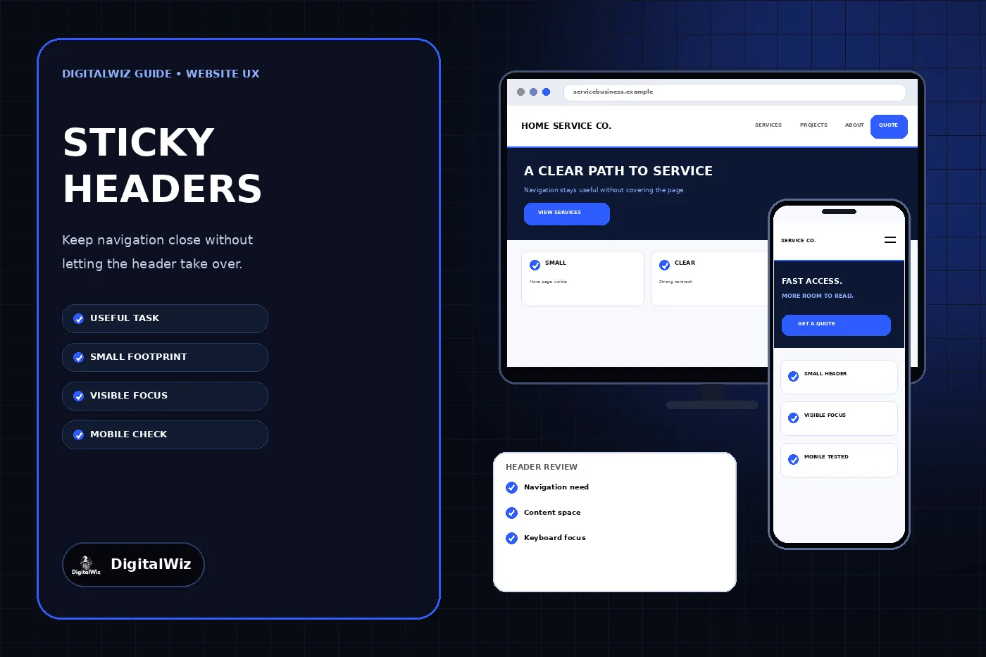
The direct answer
Use a sticky header when customers regularly need the navigation, search, account controls, or one important next step while moving through a long page. It can be helpful on a service library, detailed guide, product catalog, support center, or other website where returning to the top would interrupt a real task.
Do not make the header sticky simply because the pattern is common. On a short small-business website, the ordinary header may already do its job. A persistent bar that repeats a large logo, a full menu, several phone numbers, social icons, an announcement, and multiple buttons can consume the space customers need to read the page—especially on a phone.
The practical rule is simple: the header must earn the screen space it occupies. Keep only the controls customers need repeatedly, make the sticky state smaller than the opening header when appropriate, and verify that it never hides headings, links, form fields, or keyboard focus. The website mockups above illustrate that design decision. They are not a client website, usability result, conversion result, or performance claim.
- Long pages with repeated navigation needs: a compact sticky header may help.
- Short pages with an obvious next step: a normal header is often enough.
- Large branding or several competing buttons: simplify before making anything persistent.
- Small mobile viewport: test how much usable page area remains.
- No clear customer task for persistent controls: keep the header in normal page flow.
Start with the task the header must support
Write down what a customer should be able to do without scrolling back to the top. Useful answers might include opening the main menu, reaching site search, returning to a cart, switching an account area, calling during an urgent service decision, or requesting an estimate after reviewing a long page. ‘Keep the brand visible’ is not the same as helping someone complete a task.
Then review representative pages. A sticky header may add value on a long service guide while doing little on a brief contact page. It may be essential inside a web application but unnecessary on a five-page brochure site. Use one consistent system, but allow the header to become simpler or non-sticky where the page type does not justify persistence.
Compare the proposed header with the existing small-business website navigation. If customers cannot identify the main services or next action before the header becomes sticky, persistence will not repair unclear labels, overloaded menus, or weak information architecture. Fix those problems first.
- Name the repeated customer task.
- Identify which page types are long enough to create the problem.
- Keep only controls needed during that task.
- Remove duplicate utilities and competing calls to action.
- Test whether a normal header plus contextual links already solves it.
Choose the least intrusive persistence pattern
A fully sticky header remains visible while the customer scrolls in either direction. A partially persistent header hides while the customer moves down the page and returns when they scroll up. A static header stays in normal document flow. These patterns solve different problems; none is automatically the modern or correct choice.
A compact always-visible bar can work when the controls are genuinely useful throughout the page and the bar occupies little space. A scroll-up header can preserve more reading area while still making navigation easy to recover. A static header is often the cleanest option when pages are short, the next step appears in context, or the persistent controls would rarely be used.
Nielsen Norman Group's sticky-header guidance recommends keeping persistent headers small, visually distinct, minimally animated, and tied to user needs. That is a better design standard than copying a competitor's header or assuming that constant visibility improves every journey.
- Static: best when repeated access is not necessary.
- Always sticky: useful when a small set of controls stays relevant throughout the page.
- Sticky on scroll-up: useful when reading space matters and customers mainly need a quick return path.
- Sticky by page type: appropriate when only certain templates have long or complex tasks.
- Avoid surprising behavior changes between otherwise comparable pages.
Keep the sticky state smaller than the page it serves
Persistent interface takes space away from content. Start with the smallest header that still supports readable labels, usable controls, and the chosen task. The sticky state may use a smaller logo, fewer utility links, a collapsed menu, or one clear action even when the opening header contains more information.
Do not shrink controls until they become difficult to read or activate. The goal is not the thinnest possible strip; it is a good content-to-interface balance. On mobile, browser controls already reduce the available viewport. A site header, cookie notice, chat control, and bottom call-to-action bar can leave only a narrow window for the actual page when they all remain fixed.
Use an opaque or sufficiently solid background and a clear boundary so page text does not show through the header. A translucent bar may look polished over one hero image but become hard to read over cards, photos, headings, and form fields farther down the page. Check every shared background state, not just the top of the homepage.
- Keep the logo secondary to the customer task.
- Limit persistent actions to the few that remain relevant.
- Preserve readable labels and usable touch targets.
- Separate the header clearly from changing page content.
- Review the combined footprint of every sticky or fixed component.
Prevent the header from hiding content and keyboard focus
A header can look fine during ordinary scrolling and still cover the item a customer reaches by keyboard, an in-page link, a validation error, or a browser find result. The problem is more serious when zoom enlarges the interface and the persistent bar occupies a larger share of the viewport.
WCAG 2.2's Focus Not Obscured guidance explains that a focused component must not be entirely hidden by author-created content and specifically identifies sticky headers as a common source of overlap. Design for the stronger practical outcome: keep the whole focused control and its focus indicator visible whenever possible, rather than merely exposing a small edge.
Test the actual tab order from the browser address bar through the header and page. Watch links, buttons, accordions, form fields, error summaries, and controls near the top of each section. Include cookie notices, chat windows, and fixed bottom actions in the same test because several individually modest overlays can combine into a blocked viewport.
- Tab through the whole page in both directions.
- Confirm the focused control and focus indicator remain visible.
- Open menus and dismiss them with the keyboard.
- Trigger form errors and follow error-summary links.
- Repeat the test with every persistent banner or widget enabled.
Give anchor links and page headings enough clearance
In-page navigation can scroll a heading to the top of the viewport, directly behind a sticky header. The URL may change and the browser may move focus correctly, yet the customer sees the middle of a section with no visible heading. Table-of-contents links, skip links, FAQ links, footnotes, and form-error links all need this check.
Account for the header height in the scroll position with a shared CSS approach such as scroll padding on the scrolling container or scroll margin on target elements. Keep the offset tied to the real responsive header size instead of scattering unrelated pixel values across templates. If the sticky state changes height, test both the initial and compact versions.
Also verify direct visits to URLs containing a fragment, Back and Forward navigation, browser refresh, and links from another page. A solution that works only after a mouse click on the current page is incomplete. The target heading should be visible, the location should make sense, and keyboard focus should not disappear behind the header.
- Test skip links and table-of-contents links.
- Open a URL that already includes a fragment identifier.
- Check headings after Back, Forward, and refresh.
- Use one responsive offset system for shared templates.
- Verify the target remains visible at zoomed text and narrow widths.
Test mobile, zoom, motion, and performance together
A desktop header cannot simply be compressed into a phone-sized strip. Decide which controls remain visible, which belong in the menu, how the menu opens and closes, and whether a scroll-up pattern is easier than permanent visibility. The page must still reflow without horizontal scrolling or lost functionality when the viewport narrows or the customer zooms.
The W3C Reflow guidance describes the need for content to remain usable at narrow equivalent widths without two-dimensional scrolling, except where a two-dimensional layout is essential. Test the header at common phone widths, 200% text zoom, and 400% browser zoom rather than assuming a desktop breakpoint covers those conditions.
Keep show-and-hide motion restrained. A header that jumps, flickers, or repeatedly changes direction with small scroll movements can distract from reading and make controls difficult to target. Respect reduced-motion preferences where animation is not essential. Watch page responsiveness as well: scroll listeners, heavy effects, oversized logos, and complex menus should not make the interface feel delayed.
- Test portrait and landscape phone layouts.
- Check browser zoom and text enlargement.
- Confirm menus do not create horizontal overflow.
- Verify reduced-motion behavior and rapid direction changes.
- Inspect responsiveness on a slower mobile device or throttled profile.
Use this decision rule before launch
Keep a sticky header only when it makes an important repeated task easier and the benefit outweighs the screen space, motion, and overlap risk. Use the least intrusive pattern that solves the problem, reduce the sticky state to its essential controls, and make content—not the site chrome—the largest part of the viewport.
Before launch, compare the static and sticky versions on the longest service page, an article, a short conversion page, and a form. Complete realistic tasks with a mouse, keyboard, and phone. Follow anchor links, trigger errors, zoom the interface, open every menu, and enable other persistent widgets. If the sticky version does not make those tasks clearer or faster to recover, remove it.
If your header has grown into a stack of navigation, announcements, phone numbers, buttons, and overlays, the right fix may be a broader information-architecture and responsive-design review. Explore DigitalWiz Website Development, run a free BizScore audit, or contact DigitalWiz for a practical plan.
- A real repeated task justifies persistence.
- The sticky state contains only essential controls.
- Page content, targets, and focus are never hidden.
- Mobile, zoom, anchors, forms, and overlays all pass testing.
- The normal header remains the fallback when persistence adds no clear value.