How Do I Check My Small Business Website for Accessibility?
Test real customer tasks with a keyboard and at high zoom, inspect content and forms, then combine automated checks with manual and assistive-technology review.
The direct answer
Check accessibility by following the same paths a customer must complete: understand a service, navigate the site, open the menu, submit a form, find contact information, and recover from an error. Test those paths with a keyboard, at increased zoom, on a small screen, with images unavailable, and with an automated checker. Then have a person perform manual and assistive-technology testing before treating the review as complete.
A scanner can find some missing labels, contrast failures, structural problems, and invalid attributes. It cannot decide whether alternative text communicates the image’s purpose, whether instructions make sense, whether focus order is logical, or whether a customer can actually finish a task. Accessibility is a property of the complete experience, not a score or a toolbar badge.
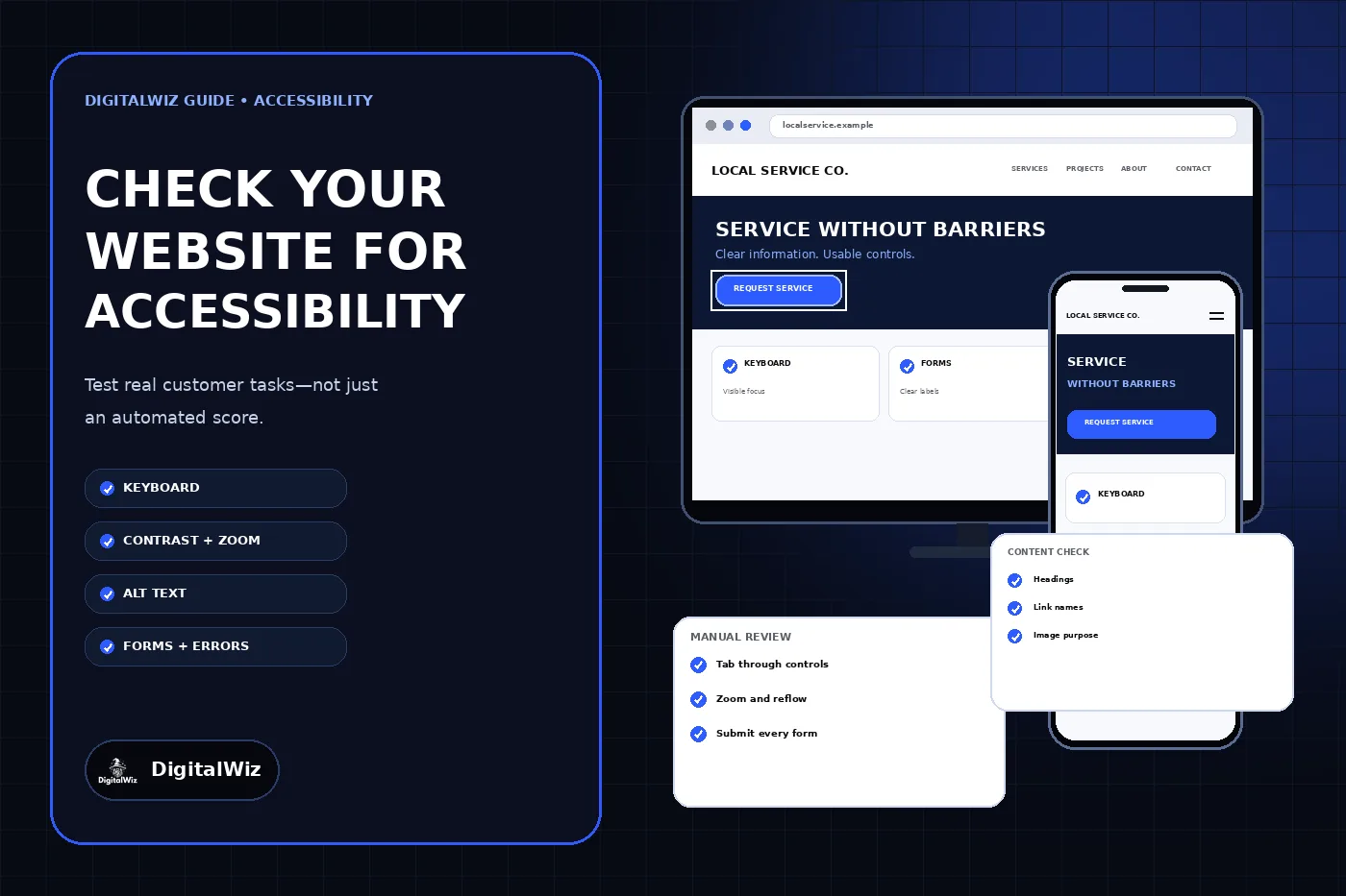
The website and review cards above are illustrative. They are not a client website, accessibility certification, legal opinion, conformance report, or result produced by an automated audit.
- Choose the customer tasks that matter most.
- Complete each task with the keyboard alone.
- Check zoom, reflow, contrast, headings, links, images, and media.
- Submit every important form and inspect its errors.
- Use automated tools for coverage, then verify findings manually.
Start with customer tasks, not a generic checklist
Make a short inventory of the website’s public routes and interactive features. For a local service business, the priority set usually includes the homepage, core service pages, contact page, estimate form, phone and email links, navigation menu, project gallery, location information, policy pages, and any booking, payment, account, or document flow. Include the mobile version and any third-party widget a customer must use.
Write each important path as an observable task. Examples include “find whether the company offers this service,” “open the mobile menu,” “request an estimate,” “correct an invalid phone number,” and “reach the business during an urgent problem.” Record the expected result and the pages, controls, messages, and external services involved. This keeps the review focused on access to the actual offer rather than isolated code issues.
Test representative pages from every template, but do not assume one passing page proves the whole site. A shared navigation problem may appear everywhere, while a missing form label or poor image description may exist on only one page. Repeat the critical tasks after templates, forms, booking tools, cookie controls, chat tools, or major content blocks change.
Put the mouse aside and use the keyboard
Click the browser address bar, put the mouse aside, and use Tab, Shift+Tab, Enter, Space, arrow keys, and Escape as appropriate. You should be able to reach every link, button, form field, menu, dialog, media control, and other action. Focus should move in a logical order, remain visible, and never become trapped inside a component.
Open and close the mobile menu, expand accordions, operate dropdowns, dismiss dialogs, pause moving content, submit the contact form, and return to the previous control. Hover-only information needs an equivalent path for keyboard and touch users. A custom control that looks like a button but cannot receive focus or announce its purpose is not made accessible by its appearance.
The W3C’s Easy Checks accessibility review recommends checking keyboard access, logical tab order, visible focus, and keyboard traps. It also makes clear that these checks provide an initial view rather than a complete accessibility evaluation. Record the exact page, control, keystroke, expected behavior, and observed failure so a developer can reproduce the problem.
- Every action is reachable without a mouse.
- The focus indicator is easy to see against every background.
- Focus order follows the visual and reading order.
- Menus and dialogs can be opened, used, and closed.
- No widget traps focus or activates unexpectedly.
Check zoom, reflow, contrast, and structure
Increase browser zoom and test the site at narrow mobile widths. Text and controls should remain readable and usable without overlapping, disappearing, or forcing horizontal scrolling for ordinary page content. Sticky headers, chat buttons, cookie banners, and fixed call-to-action bars deserve special attention because they can hide focused controls or consume most of a small screen.
Check color contrast for body text, muted text, buttons, form borders, error messages, links, hover states, and focus indicators. Do not communicate status by color alone. A required field, selected option, validation error, or success state should have a text, shape, icon, or programmatic cue that still works when color is unavailable.
Inspect the page title, landmarks, headings, lists, and reading order. Visual size alone does not create structure. A screen-reader user should be able to identify the main region, navigate meaningful headings, understand link names outside their surrounding paragraph, and encounter content in a sensible order. The W3C organizes WCAG 2.2 under four principles—perceivable, operable, understandable, and robust—and provides testable success criteria rather than a visual style recipe in its WCAG overview.
Review images, audio, video, and motion in context
Every image needs an intentional text-alternative decision. A meaningful image needs concise alternative text that communicates its purpose on that page. A decorative image should usually have an empty alt attribute so it does not add noise. A linked image or image button needs the action or destination, while a complex chart or diagram may need a short identifier plus a nearby text explanation of the useful information.
Do not judge alternative text from a spreadsheet alone. Read the image, caption, nearby copy, link destination, and page goal together. Repeating a filename or stuffing keywords does not help someone understand or operate the page. The DigitalWiz guide to writing alt text for business website images covers the decision in more detail.
Provide captions for prerecorded video when speech and meaningful sound are part of the content, and provide an appropriate transcript or audio description when the information requires it. Give users control over audio and moving, blinking, scrolling, or auto-updating content. Check carousels and background video especially carefully: the controls must be reachable, labeled, visible, and usable without precise pointer movement.
Submit every form and force the errors
Test forms as complete conversations. Each field needs a persistent, meaningful label; placeholder text alone is not a dependable label. Required status, accepted formats, and unusual instructions should be available before submission. Group related choices clearly, give buttons specific names, and keep the focus path aligned with the visible form order.
Submit the form empty, enter invalid values, correct one field, and submit again. Error messages should identify the field and explain how to fix it. Do not rely only on a red outline. Move focus or provide an error summary when needed so the customer can find the problem, and preserve valid entries instead of making the person start over.
Finally, verify the success state and the real delivery path. The customer needs an understandable confirmation, and the business needs the inquiry to arrive at the intended destination. Accessibility testing does not replace delivery testing: the separate DigitalWiz guide for a form that says sent but delivers no email explains how to trace that operational failure.
- Visible labels remain available while the field contains text.
- Instructions and required status appear before they are needed.
- Errors are identified with words, not color alone.
- Focus and an error summary help users find failures.
- Success messages and lead delivery are both verified.
Use automation as a finder, not a verdict
Run more than one appropriate automated check across the shared templates and critical task pages. Browser developer tools, linting rules, and accessibility testing libraries can identify many repeatable issues, but review the evidence behind each result. A missing accessible name may be clear; a warning about heading order or alternative text may require human judgment in context.
Do not publish an “accessible” badge or claim conformance because one scan reports no errors. The W3C’s Easy Checks page explicitly describes its process as a way to get an initial idea and says that more assessment is needed for a definitive, comprehensive evaluation. Manual keyboard testing, zoom and reflow checks, content review, screen-reader testing, and feedback from people with disabilities cover questions an automated rule cannot answer.
Keep the report practical. Rank barriers by customer impact, how many pages or components they affect, and whether they block an important task. Fix shared components first, then page-specific content. After each change, rerun the original manual steps as well as automated checks so a code-level pass does not hide a new usability problem.
Use WCAG as the technical standard and get legal advice when needed
WCAG 2.2 is a detailed technical standard with success criteria at levels A, AA, and AAA. W3C encourages use of the latest WCAG version, but selecting a target, evaluating conformance, and documenting exceptions require more than running a quick audit. Define the target in the project scope and require evidence for each applicable criterion.
Accessibility obligations depend on the organization, services, jurisdiction, contracts, and current law. The U.S. Department of Justice publishes guidance on web accessibility and the ADA, but a marketing article cannot determine a particular business’s legal duties. Use qualified legal counsel for that question and an experienced accessibility professional for a formal evaluation or conformance claim.
Do not wait for a legal discussion to fix an obvious customer barrier. Missing labels, invisible focus, keyboard traps, unreadable text, inaccessible menus, and vague form errors prevent people from using the site today. Correct the barrier, document the change, and keep accessibility in design, development, content, procurement, and release reviews.
Turn the review into a maintained process
Create a small regression set from the critical tasks and run it before major releases. Assign an owner for the shared navigation, forms, content templates, media, third-party widgets, and accessibility feedback. Include acceptance criteria in vendor work rather than discovering after launch that a booking or chat tool cannot be used without a mouse.
Give content editors simple rules for headings, link text, image alternatives, captions, and documents. Give designers approved contrast combinations and visible focus treatments. Give developers component tests and manual keyboard steps. Keep an accessible way for customers to report a problem, and route the report to someone who can respond and fix the underlying issue.
The practical next step is to choose the homepage, one core service page, and the primary contact or estimate form. Complete the keyboard, zoom, structure, image, and form checks above; log reproducible failures; and fix the highest-impact shared component first. If the website needs a broader rebuild or task-based accessibility review, explore DigitalWiz Website Development or contact DigitalWiz for a practical plan.
- Three critical routes with written customer tasks
- Manual keyboard and zoom results for each route
- Automated findings verified in context
- Owners and deadlines for reproducible barriers
- A regression check before the next release